Case Study: How My First App Ranked #2 in the Google Play Store
11,000+ active users worldwide | 4.7/5.0 stars from 600+ reviews

Overview
I researched, ideated, designed, coded, and published a mobile app called Latter Day Temples for my religious community, which has achieved the following:
- 11,000+ active users worldwide
- 4.7/5.0 average star rating from 600+ reviews
- Ranked #2 in Google Play’s Lifestyle category (September 2016)
This is a case study explaining my design process and how my app made these achievements.
Background
The 16 million members of The Church of Jesus Christ of Latter Day Saints are encouraged to set personal goals for how often they attend one of the 160+ temples around the world.


The Problem
Back in 2016, church members didn’t have a convenient way to record temple attendance, track personal goals, visualize where temples were being built, and quickly access temple schedules and contact information.
My Design Process
My design process involves identifying an opportunity, iterating to find the right solution, and then building, launching, and measuring that solution.
While I enjoy the simplicity of a typical 5 step design thinking processes, it takes more than 5 steps to build a real world solution. My process involved 10 steps:

Step 1: Define 🎯
Project Goals
Although this project was not a business, I prioritized my project goals as if they were business goals. My project goals were to:
- Build personal branding for my portfolio
- Empathize with developers by implementing my own designs
- Help members of my religious community set and reach their personal temple attendance goals
I set a time constraint of 2 months to design, develop, and publish my app.


Step 2: Research 👪
Recruiting
Using my social network and personal contacts, I quickly recruited users that matched my target audience (church members 12+ years old that consistently attend temples).
User Research
I started out by conducting both remote and in-person user interviews, conducting surveys, doing usability tests with competitor’s apps, and researching group forums to discover what people were saying.
Competitive Analysis
When I started this project in July 2016, there were only two direct competitors in the Google Play App Store:
- LDS Temples Pro (no longer listed in Google Play)
- Temple Passport (no longer listed in Google Play)
Interviews with users, online reviews, and app store ratings revealed that these apps had limited functionality and offered a poor user experience.
The common alternatives to using an app for tracking personal attendance included spreadsheets, calendars, and journals.


Step 3: Synthesize 📊
Affinity Diagraming
I triangulated all of my research and insights on an affinity diagram, clustered groups together, and identified patterns and pain points that I could translate into jobs-to-be-done.
Jobs To Be Done
- When I set temple attendance goals, I want a better way to keep track of my progress.
- When I plan a temple trip, I want a quick way to look up the temple’s schedule.
- When I attend a temple, I want to record my thoughts and feelings afterward.
- When I hear temples getting announced, I want to see where they are in relation to other temples and visualize where the Church is growing.


Personas
Personas were created based off my research. Using personas allowed me to acquire user empathy and make targeted design decisions.


Step 4: Ideate 💡
Sketching
Keeping my personas and jobs-to-be-done in mind, I sketched out several different ideas and potential solutions.


Step 5: Design 🎨
Information Architecture — Card Sorting
I used Card Sorting to discover patterns in how my users cognitively organize and group information.


Wireframes
Wireframes helped me to focus on navigation, structure, and allocation of space. I first created frames on paper, then I used Sketch to create higher fidelity.


Visual Direction
Users consistently reported that existing competitor apps were “dull, lifeless, stiff, or confusing”. To differentiate my app, I wanted to empower it with the following adjectives:
- Simple, but not boring
- Friendly, but not irreverent
- Lively, but not over-energetic
- Pure, but not pretentious
Design System
This led me to using lots of white space, soft blue gradients, rounded edges and curves, overlapping elements, and featuring the beautiful temple photography.


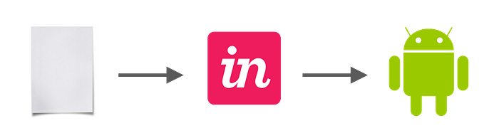
Step 6: Prototype ⚙️
During my 2 month process, I created 3 different prototypes:
- Paper prototype
- InVision prototype
- Coded prototype
Using multiple levels of fidelity across different mediums offered me flexibility, speed, and a wide range of insights.
Step 7: Test 🧪
User Testing
I conducted 20 minute tests with my prototypes that involved several tasks and open-ended questions such as, “Think of a temple you want to visit. Where would you find directions to that temple?”
Insights
While users were excited about the value proposition and paint points my prototypes solved, I identified several patterns and flaws in the usability and navigation that could be improved such as:
- Using a bottom navigation instead of a side menu
- Improve the search functionality to include countries

Steps 4–7: Iterate 🔄
My process is iterative, not linear.
I cycled through ideation, design, prototyping, and testing 3 times, advancing to higher fidelity and greater confidence in my solution through continual learning. After the third iteration, I felt ready to build my app.
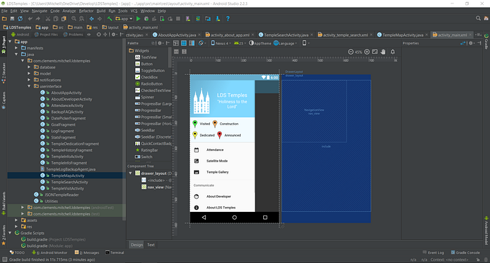
Step 8: Build 🔨
“Hand off to the developers” is not an event, but a process of communication from project inception.
Transition from Design to Code
Because my high-fidelity prototype was created using code, most of that code was used in the final implementation. In addition, the app was designed with existing API’s, libraries, and components in mind, so the transition from design to code was fast and efficient.
Constraints and Prioritization
I was, however, newer to Android development at the time, and I encountered technical challenges that I was learning to solve. In order to adapt, I considered my users’ needs, project goals, and developer resources in order to re-prioritize features and deliver a minimal viable product on time.
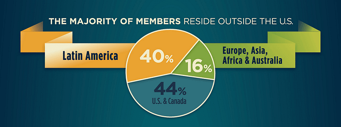
Internationalization
More than half of my target audience live outside the United States, and have phones with limited wifi connections and storage space. This meant I needed to:
- Compress all the images and code base to reduce the app download size
- Ensure the app had an offline mode
- Implement automatic language localization for each country
Step 9: Launch 🚀
Publishing
You can view or download the app in the Google Play App Store.
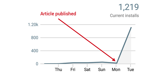
Promoting
With my app published, it was time to promote awareness. I landed an interview with LDSLiving, a news and blog source that targets my same user group. They published an article about my app, and within a few days I had my first 1,000 users.
Step 10: Measure 📐
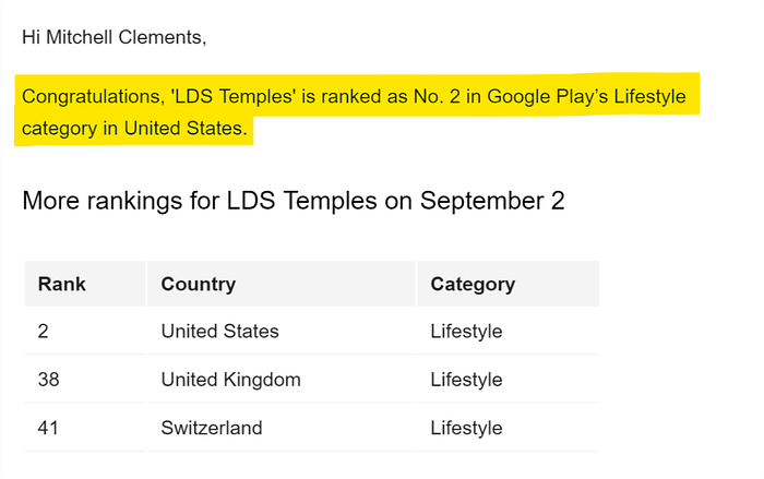
Since publishing, my user base has grown and to my delight, my app ranked as No. 2 in Google Play’s Lifestyle category in the United States back in September 2016.
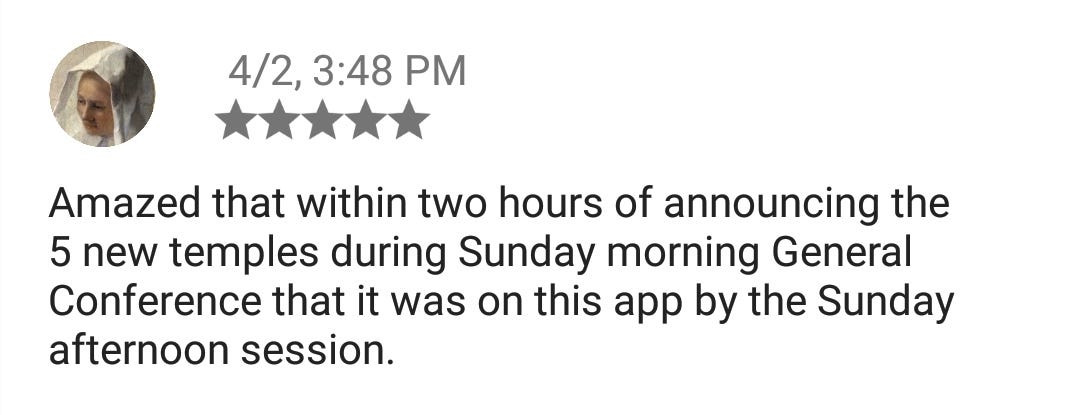
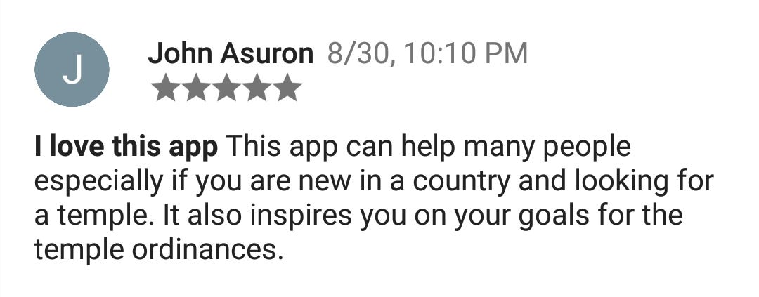
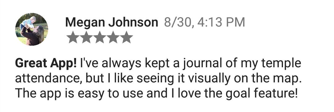
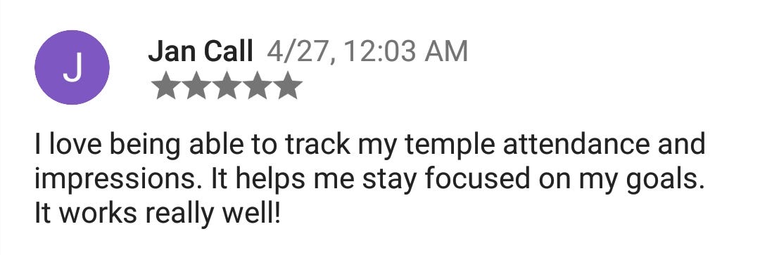
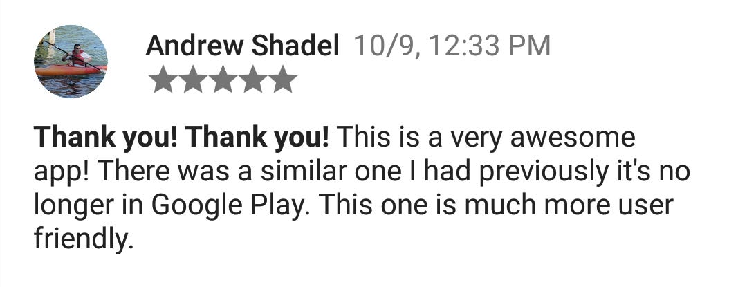
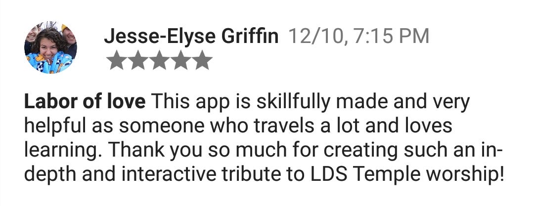
User Testimonials
Today the app supports 11,000+ active users with a 4.7/5.0 average star rating from 600+ reviews.


And of course, there’s always that one guy… 🤷♂️

A Work In Progress 🔄
Although the results have been very positive, for the past several years I have been receiving user feedback, analyzing analytics, and updating the app according to my project goals and users’ needs.
What I Learned
- Understanding my users’ needs and doing essential research was the key to making my app successful.
- Communicating and collaborating with developers from the beginning leads to greater efficiency overall.
- Fixing mistakes during the prototyping stage is much easier than fixing mistakes during production.
- Finding a balance between project goals and user needs is tough, but necessary and achievable.

Let Me Know What You Think!
Thank you for your time. I would love to hear what you think!
✉️ Send me an email at mitchclements.design@gmail.com,
💬 Message me on LinkedIn,
👏 Or clap for this story! 😊
Sincerely, Mitch Clements